Showing posts with label Direction. Show all posts

Sunday, 27 March 2016

Creating Samplers

What initially started out as a practical measure, creating small samples on one long piece of fabric allowing me flexibility of how I could cut them up and present them later, now makes
sense as final pieces that imitate the old samplers that inspired them. This also offers an extra versatility to the context of my work. Their initial context of fabric that could inspire ideas for a range of techniques remains, however as longer pieces they can also be used as exhibition pieces that can be displayed in various ways.


Although the main focus of my body of work is still the delicate hand stitch and machine embroidery samples. I have taken lots of close up detail photographs of my work and manipulated them in photoshop to make digital prints. I have then shown these prints in various contexts.


After a month or so of waiting I have also finally heard back from the live brief at Gawthorpe Hall, and am very excited to be offered an exhibition space on the Manchester School of Art stand at Knit and Stitch Show in London and Harrogate. I will get to exhibit alongside four other students and MMU staff, including Alice Kettle. The tutors were very complimentary about the samples I put forward and have asked me to make a new piece over the summer especially for the show. They have asked me to complete a 2 meter by 2 meter piece with lots of my little coloured detail within. This will be a mammoth task but will give me something to work towards once I've graduated and I am looking forward to manning the stand in October and November. I look forward to a tutorial with the curators of the stand to discuss the best kind of fabric to use and the frequency of the detail I shall be adding.

Because the hand stitch techniques are so time consuming I have been looking alternative methods that could be used to create similar effects. This included an attempt at hand weaving on a frame using thicker yarns. Although I quite like the end result, this is not an appropriate technique for my work. It is only less time consuming if I use considerably thicker yarns, and the structure would become compromised if I were to get more adventurous than a plain weaving pattern.


Thursday, 25 February 2016

Developing work for unit X

This unit I am going to develop some of the techniques inspired by my work for Gawthorpe Hall. I have created some more drawings based on research into old/traditional embroidery techniques, combined with my unique use of colour, inspired by my research into combating colour blindness and chromophobia. I am choosing specifically to focus more on patterns found in traditional darning and needleweaving.
Embroidered by Marie Terese Fourbisseur found in the Cooper Hewitt Collection: http://collection.cooperhewitt.org/objects/18489513/
Because my work is based on colour, my tutor thought it would be appropriate to enter me into the International Colour Competition run by the Society of Dying and Colourists. This was an absolutely amazing experience, and forced me to address how I present my work. I had very little time to throw together four boards that explained my samples. I also had to show that my work could be applied to a fashion context. This meant doing some visualisations and showing the process to reach them. I also had to make some executive decisions about the best way to present my boards. After some discussion with a few tutors we came to the conclusion it would be best to present my work onto a grey background instead of white because of the nature of my samples.


Not only did I enjoy a dye workshop and an excellent lecture on colour theory, but I also came away with a certificate of High Commendation from the judges as they we impressed with time, intricacy and detail that had gone into my work.

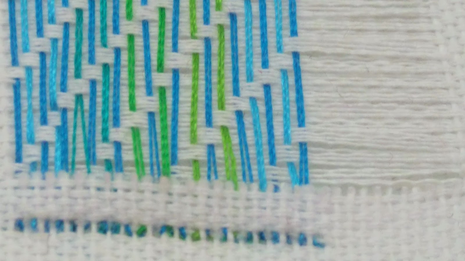
Although I think the techniques I used for Gawthorpe are very effective and create something really unique, the process is truly painstakingly slow. After a bit of fabric exploration I've found a handful of fabrics that have just the right weave, that I can snip out the weft. This speeds up the process slightly without losing the intricacy.


I have also entered some of my samples from the practice unit to be displayed as part of the TIP in Progress show in the art school. Although the brief for this show is large scale pieces, it is good they have offered to show smaller samples also. I hope my samples will be picked, they work well as a small collection so that might give them an edge.

Saturday, 30 January 2016

Self-Initiated: Refining Samples

To continue with my self-initiated brief I have taken forward samples created from my triangle drawing and tried to pay attention to colour matching and getting the right materials. My first samples used a pink that was slightly too red-y: 


After these I managed to find a more purple-y pink to match my drawings better and created some more samples using similar techniques (aplique and machine stitch): 


I also attempted to recreate a sample or two on the brand new quilter machine, although I’m quite pleased with the way the sample has turned out, I felt like I was using a very big and complex machine to do something very small and detailed piece of work, and not using it very efficiently. I would like to try the quilter again but perhaps if I were to upscale my work. 


Tuesday, 26 January 2016

Gawthorpe Hall: Refining Samples

This week I’m looking to take two main samples forward and really refine them. I have been experimenting with needle weave in different fabrics and in different scales.
I have also been creating more logcabin patchworks so that I can see the full effect of the patches together and the patterns they create. These are the two lines of enquiry I have chosen to explore for Gawthorpe Hall.

I have developed my Gawthorpe Hall samples. I have created two collections, needle woven samples inspired by the beautiful darned pieces from the archive and logcabin. I have taken inspiration from the colour palette of my self-initiated brief and used much finer fabrics and threads to put my own modern twist on these pieces. Until you have sat and repaired a damaged hole in a piece of fabric do you truly appreciate the intricacy of it. We tend to take this for granted these days because of the pace at which technology can produce it.


For my logcabin I have contrasted old recycled sari silk, hand dyed cottons and modern fabrics such as PUC to give this old technique a modern twist. I’ve also modernised the process, using the machine to quickly and roughly patch these pieces together. I enjoy the effect this gives and reminds me of the sample from the Gawthorpe archive marked by Miss Kay “do not do it like this, it is wrong”.


I found this artist who also uses machines for quilting and in a slightly unconventional way that might not be considered traditional:


Krista Jo Mustain Geometric wallhanging/coral quilt 2011/2012

Tuesday, 19 January 2016

Gawthorpe Hall: Experimenting

This week I have been doing some experimental samples inspired by the pictured I took at Gawthorpe hall and some drawings I have done from them. 

This sample was inspired by some of the samplers, I decided to use the Pfaff to recreate a similar look. 

I like that the same effect could be so easily replicated, however I think as a sample it's not that interesting. I could potentially develop it by sampling using my own colour scheme but it still would not really fit with the theme for the project which is "significcance". 

My next sample was my own colour pallet applied to a darning sample: 


Although I’m very pleased with the effect here, I think I could develop it by working onto a white background and by giving the little sections of darning more space. I feel like these samples will be more relevant to the theme of significance because darning is a means of repairing and we tend to only bother repairing things that carry significance to us. Also it takes an awful lot of patience and time to darn which creates a sense of significance in itself. 


To modernise the logcabin I have pieced new fabrics next to old, in order to create contrast. I have also used only machine stitch to create these logcabin samples: 


I feel like these logcabin samples also fit the theme of significance because they are made from upcycled fabrics that once had other purposes and carry their own meanings. I look forward to making a small collection of these little squares for this brief and perhaps taking them forward into the next project to make a garment or quilted piece.

Wednesday, 13 January 2016

Gawthorpe Hall

I really enjoyed the trip to gawthorpe hall, the collection was really interesting and inspiring. The collection dated back as early as the 15th century, it’s absolutely amazing to see what the amazing things people created completely by hand. It was however very frustrating that all of the samples we kept in plastic wallets that meant that all of the photos of samples are very low quality. Also the visit felt it was slightly lacking seeing as we could not feel and have a play with the samples.


I was particularly interested in the all of the impressive old hand techniques: 


I intend to introduce some of these techniques to display my colour palette. I have experimented with logcabin, darning patterns and sampler structures. I have used the Pfaff machine to imitate the sampler stitches, hand-dyed fabrics for the logcabin samples and the Irish machine to help gather threads.  


Friday, 4 December 2015

Developed Colour Drawings

Although my work is quite similar to Michael Kidner’s work I have decided that I will not participate in that live brief. Although looking at his work has been quite helpful when creating my own: 


 I’m not sure my work would be totally appropriate to that brief. I also really like the look of the Gawthorpe Hall project and think this would be a more inspiring project to take up. I feel like if I took up the Michael Kidner brief I would just be creating work I was going to create anyway. It makes more sense to me to take up a live brief that inspires me to create new work instead.
 

In light of this, I have continued my sketchbook in order to create a little book of colour. I absolutely adore doing these drawings, although they are quite time consuming. My latest drawings have explored using watercolour one way and brighter lines drawn the opposite way. I love the colours produced by the watercolour and the bright contrast of the inks.


I think these would be really interesting to reproduce with the idea of cutting holes into fabric and then laying or stitching threads behind. 

I have also done some drawing that play around with the idea of shape as well as colour: 


I really enjoy these drawings and see a lot of similarity between these and Victoria Snape's: 


Like my more recent drawings there is a geometric look that has been disrupted by a hand drawn element. 

I look forward to taking these drawings into fabric, I will experiment with aplique, hand and machine stitch, making sure I pay attention to the white space surrounding and colour matching. 


Wednesday, 4 November 2015

Developement

After deciding that the large scale samples were not quite appropriate for my work I decided to try and create some medium sized samples that could potentially be used as "ribbons" in something bigger to try and maintain some of the colour intensity. However I found that I really liked them as a little collection that gradually increase in scale: 


I enjoyed creating fabric samples with the embellisher and then using the photocopier as a tool to manipulate these samples. 


I then decided to print these onto acetate to see how the opacity affected the drawings, and then developed these further by adding a solid satin stitch. 


I thought it would be interesting to make these little pieces into something light could come through. So working with my scale I felt that fairy light shades would be an appropriate context for my work: 


I really like the way the light comes through and creates different coloured shadows. Although I think my work does look good in a lighting/interiors context I think next unit I would like to try make some more final products.
I can maybe see my work as smaller feature such as a pocket or edging on a garment, alternatively as a bigger statement piece such as a scarf: 


http://scarletchamberlin.com/2014/10/09/full-mooned-darning/


 It would also make a good feature on accessories or perhaps even interiors such as cushions. 

Thursday, 22 October 2015

Up-scaling Samples

In order to upscale my work, I have experimented with a variety of techniques. I have created patchwork sample using disperse dyes. I also tried to recreate the grid effect using satin stitch and fill stitch on the multihead embroidery machine.


I really like this sample because I feel I have successfully used a fully computerised technique to create something with irregularity that reflects my hand drawn style. 

I also experimented with the use of ribbons and disperse dyed fabrics. Again by creating small irregularities in a larger repeat pattern I've feel I've added an element of the hand drawn. 


I also attempted to produce some prints using my smaller Bradford Brief sample and taking it into photoshop and editing it.


 I really enjoyed doing this in photoshop however I’m not really sure what kind of context it could be applied. I also feel like digital prints are a little flat to fit in with the rest of my work, so maybe next time I would produce some that I could work back in to.

Finally I like this patchwork sample made of fabric I have disperse dyed and cut up and patched back together. I feel it best represents one of my samples blown up to A2 size.


Although I am pleased with the outcomes and can see them more easily fitting into a fashion or interiors context, I feel that my samples are more interesting on a smaller scale. Larger scale samples seem to lose their intensity that is so prominent in my drawings. I also found that to maintain the intensity, the samples were equally, if not more, time consuming. Finally they lose the slight optical illusion effect that is quite prominent in both my drawings and the smaller samples. 

Monday, 21 September 2015

Experimenting

This week I experimented with lots of different techniques creating a range of samples. I really like the effect created by contrasting a bold machine satin stitch with the more irregular hand stitch. I feel this reflects well where I have used different media in my drawings.


In an attempt to create some speedy samples I tried to lay down threads and stitch over them. Although I like the colour mixing in these samples I feel like some of the linear and grid qualities of my drawing have been lost.

To take a different approach I experimented with some beading in between machine stitches which although I quite liked the contrast in weights of fine fabric and heavy beads however not all of the beads were opaque and some of the colour intensity was lost. Also I feel that the uniformity of the beads means the hand drawn qualities of my drawings have also bean lost.


I also found this with some samples I created using water soluble. I found that a lot of the linear grid qualities were lost and that having a white background would better reflect my drawings.


I have also created some only hand stitched samples, the first of which was needle weaving. I really like this sample because I have used the three primary colours and woven variegated threads through, which really recreates a pixel effect. I also like this sample because it creates a little series and sits well in the white space around it.


This week I would like to try and keep my backgrounds white to better reflect my drawings and experiment with found materials such as ribbons to help make some of the processes a bit quicker but still maintain a strong grid structure. 

I really enjoy creating these small scale samples, I think in terms of context I would like to produce a collection of final samples that might be bought by others as inspiration. It would be interesting to try and produce a sample book similar to the work available from James Hare Or some kind of colour trend book similar to ones found at: http://www.james-hare.com/607-embroidered.html


Monday, 14 September 2015

Colour Research

Having spent the summer doing drawings extracting colour from places I’d visited over the holidays, I was swapping visual research with a fellow art and design student who is colour blind. He told me he couldn’t see the colour purple. I was really taken aback by the idea of someone not being able to see an entire colour. So I started thinking about ways in which we as humans create colour and mix colours. He is blue/pink and green/red colour blind so it would make sense that he would struggle to see purple. After considering ways in which colour is made up on screens in pixels I decided I would see if there was a way to translate this effect into fabric. After exploring and looking deeply into woven fabric that use different colours for warps and wefts and how that can drastically change how a colour looks I decided to create some drawings:


I have thought about using lots of different materials for my drawings including inks, crayons and coloured papers for collage, however I feel these crayon and ink combination drawings are particularly successful. 
I think I’d like to experiment using the embellisher and couched down threads as well as experimenting with different hand stitch techniques such as needle weaving and kantha stitches.
I think it will be really interesting to see if I can recreate this different marks made by the different media I have used and whether I will be able to maintain the same level of optical illusion as I have managed to achieve in my drawings.
I really like the “grid” quality of my drawings and how this reflects woven cloth in my drawings and I think this is something I want to try and recreate in my embroidery.